Trade App
BRIEF:
Design key elements for a new social trading app identity. Trade is focused on helping people connect to become stronger, smarter investors. The identity should feel connected and bold, and communicate not only a sense of healthy competition, but also a personal journey of growth.
Approach:
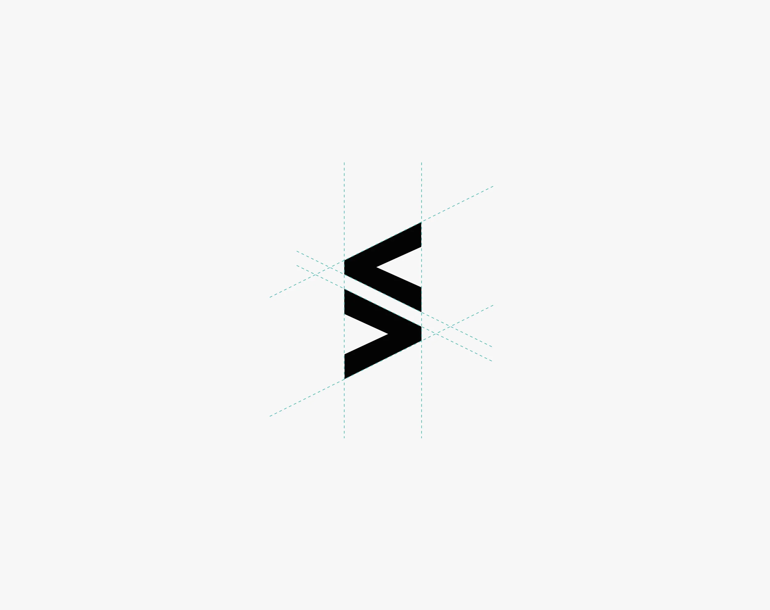
I drew on the concept of “Skilful Rivalry” to create a graphic mark that feels like an equal meeting of minds in an exchange, and also an upward trajectory of growth. The triangular shapes reference ‘less than’ and ‘more than’ symbols, which speak to the nature of markets i.e. going up and down day to day, while the investor stays steady and committed long term.
More images coming soon.
TYPE:
Identity graphic mark, icon set, and merchandise
CLIENT:
Trade
ROLE:
Graphic Design